

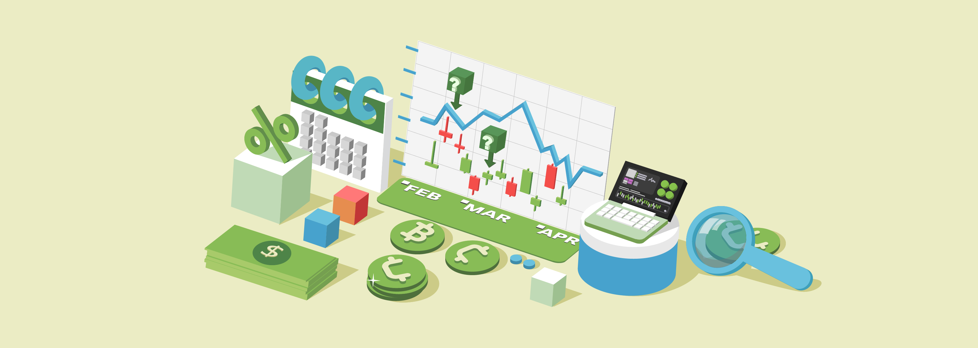
Charts are visual ways to track the price movement of a cryptocurrency. Traders of all types use them for technical analysis. Fundamentally, a crypto chart is organized in the same way as those of other assets, including stocks, forex pairs, and commodities.
How do crypto charts work?

Every chart is made up of an X-axis that tracks time, and a Y-axis that tracks the price of the asset at that moment of time.
Most charting platforms allow you to customize the X-axis according to the timeframe you want to track. Traders often flip through both longer term (yearly, monthly, weekly, and daily) and shorter term timeframes (12 hour, 4 hour, 1 hour, 5 minutes, and even smaller increments).
Note that because crypto trades 24/7, its charts start a new day at 00:00:00 UTC. In contrast, for US assets in traditional markets, most charts start a new day at 9:30AM EST.
Types of charts
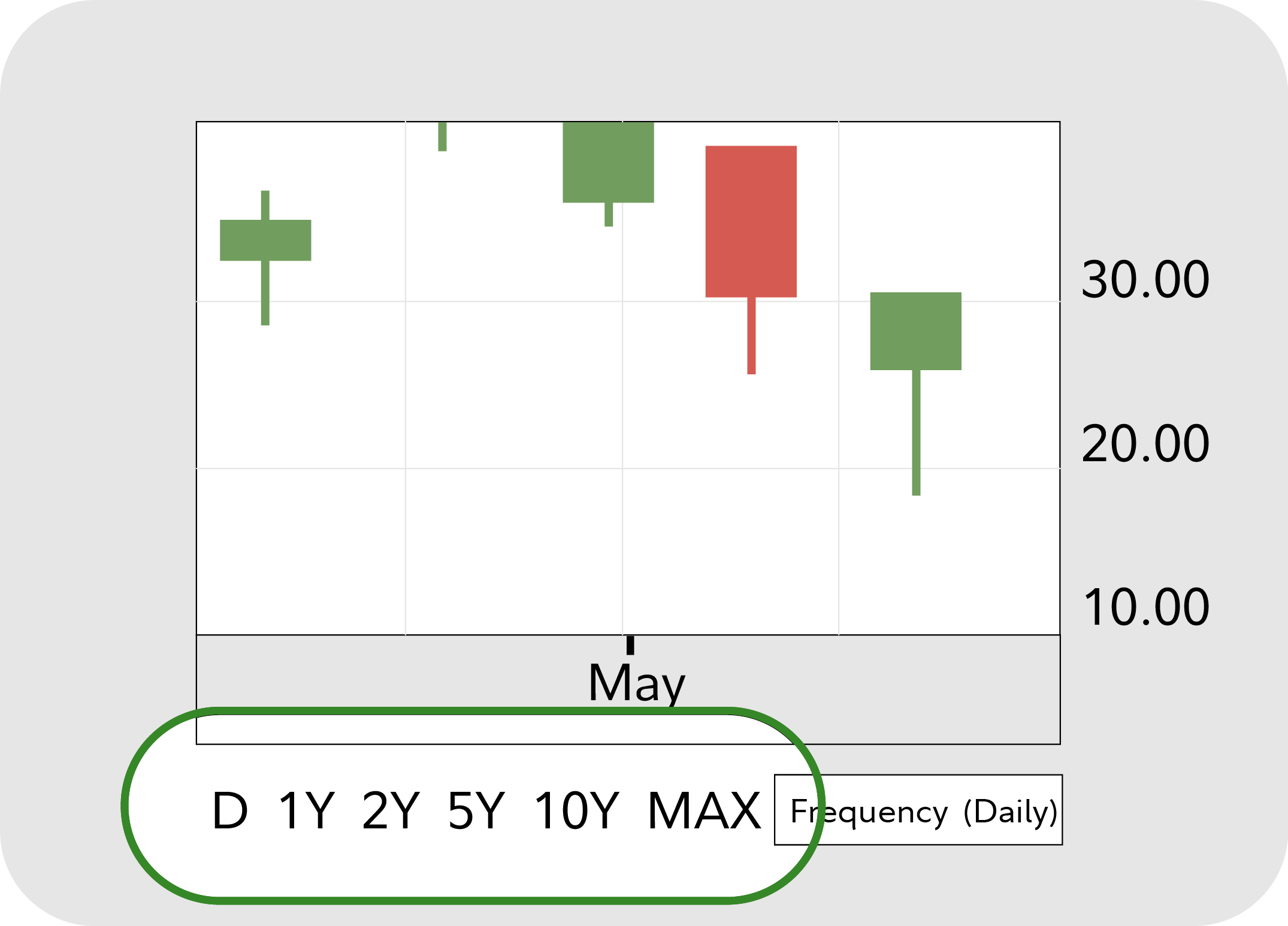
Candlestick
One of the most popular chart types is the candlestick chart, which uses candles to visualize price. Each candle represents a timeframe. For example, if you are on a 1 hour chart, each candle represents 1 hour of price movement. If you are on a 5 minute chart, each candle represents 5 minutes of price movement.
The candles visualize where price is at the candle's open and close, as well as its high and low during that timeframe.
Most commonly, a green or white body indicates the price has gone up, and a red or black body indicates that it has gone down.
Line
This type of chart is usually used to get a "big picture" view of price movements. It connects the closing prices over a specified time frame. Line charts are commonly used with mutual funds, since they have only closing prices and no intraday movement.
Bar
Bar charts mark the opening, high, low, and closing price with simple lines. Conceptually, they're similar to candlestick charts, but don't use boxes to create candlestick bodies. Bar charts are also called OHLC charts (Open, High, Low, Close).
What are chart trends?
Uptrend
A chart is in an uptrend if it's making higher highs and higher lows.
Downtrend
A chart is in a downtrend if it's making lower highs and lower lows.
Sideways
A sideways trend (also known as "consolidation") occurs when price moves sideways in a horizontal range.
How do traders use charts?
In addition to tracking trends, traders often use charts to perform different forms of technical analysis. This can include drawing support and resistance lines, as well as applying indicators like moving averages, MACD, and RSI.
These can help traders create strategies for when to buy and sell an asset.
Learn more about technical analysis here.
See it in action
Analyze candlestick, line, bar, and more charts on Fidelity Chart+. Test multiple indicators, spot trends, compare multiple assets (including cryptocurrencies, stocks, and more), and access all your charting needs.